
The Challenge
Create a better experience for the 58% of our who churned within the first 90 days of joining our platform.
Our onboarding process lacked guidance, failed to connect with customers’ goals, and often overwhelmed them with too much information too soon.
Company Sharesies
Team Jenna Ritchie (Design Lead), Cyma Parbhu (Product Manager), Gaurav Chandani (Senior software engineer)
Scope 5 months
My role
I led a continuous discovery process, using A/B testing, user research, and data analysis to identify what would improve retention and engagement. Across the project, we ran 6 A/B tests to uncover three core opportunities:
Opportunities & Solutions
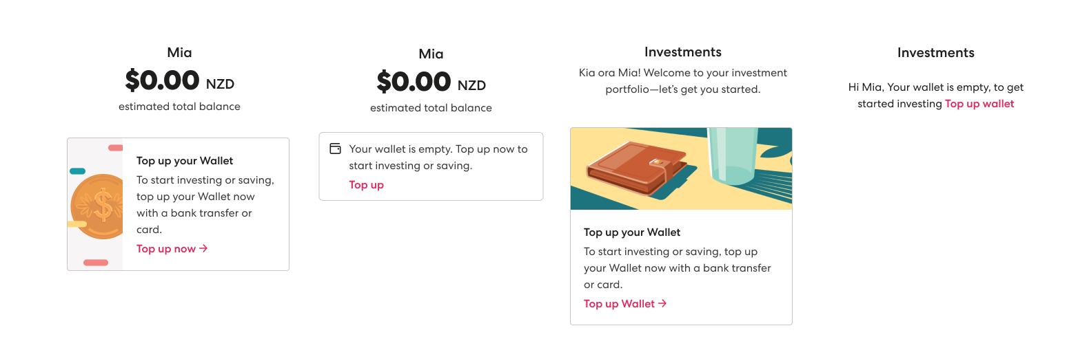
Minimize distractions and noise to keep customers focused on their goals.
When we present numerous ideas without a manageable way to process them all at once, users' focus becomes diverted repeatedly, and they are left feeling overwhelmed. As we added more features, the ambient noise gets louder. We become so accustomed to noise that we no longer register it, prompting us to add more noise to compete with what’s already there. I focused on A/B testing all of the elements to understand when the right time to introduce this step was, and how much noise it should add.
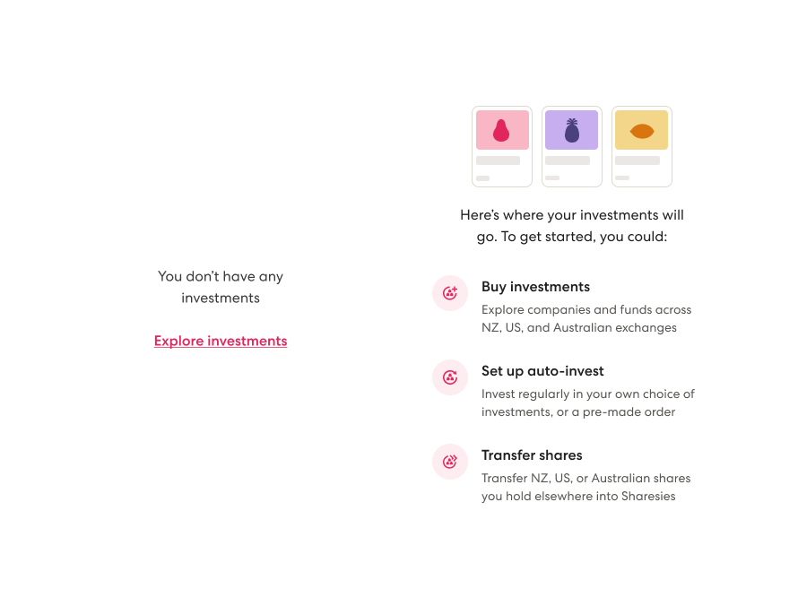
Help people decide if Sharesies is right for them
The Sharesies website doesn’t always play a role in someone’s choosing us as their investing platform. So our welcome journey experience needs to double as a sales pitch.
“I go to the Store, I download the app to see what it’s got, even though I won't be able to log in—what are all the features? I compare all of these things and then decide.”
To address this, I focused on aligning our messaging with the outcomes users aspire to achieve, making a clear case for why they should continue exploring. I guided teams to prioritize messages that show how our features help users meet their goals, introducing these features gradually to build confidence and inspire deeper engagement with the platform.
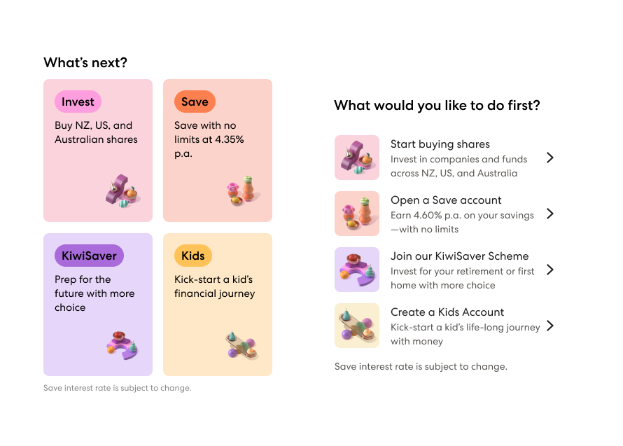
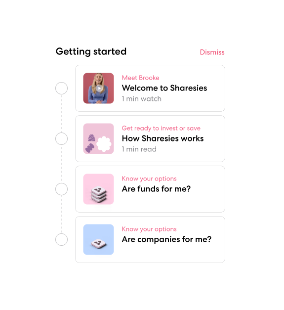
Create memorable pathways that teach customers how to use our product.
By guiding users on how to use key features, we ensure users can navigate the product with confidence. The user's initial interaction with the product establishes a mental model of how it works. We began to eliminate situations where we encouraged a user to sign up for a product or feature, only to find that it was located elsewhere in the navigation. I saw an opportunity to onboard our new customers to our navigation, making it clear what each area of our product was intended for, instead of adding messaging to the areas of the product that had the most visibility.
Outcomes
As a result of this work, the rate of customers depositing within 7 days of sign-up increased by 4%, and the rate of customers using more than one product has continued to rise.
Next Project:
Push notifications framework