Mobile Design vision
Create a 3 year vision for Trade Me mobile design.
Establish a shared insight across all of mobile, to create a unified ground zero for our incoming mobile design system.
Company Trade Me
Scope 4 months
Team Rachel Radford (Design Lead), Jenna Ritchie (Senior Designer/Lead)
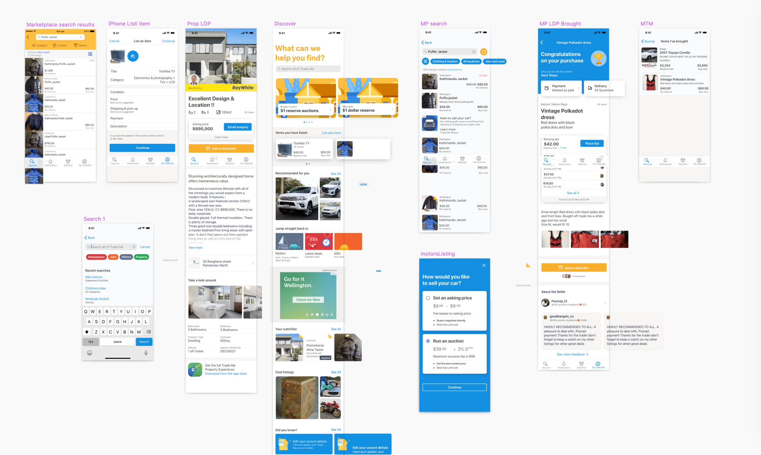
Our mobile apps had leaned so heavily towards native convention - our mobile platforms no longer felt like they both belonged to the same company.
Since Trade Me's founding, the brand has grown organically, but this hasn’t led to a cohesive experience across our three platforms.
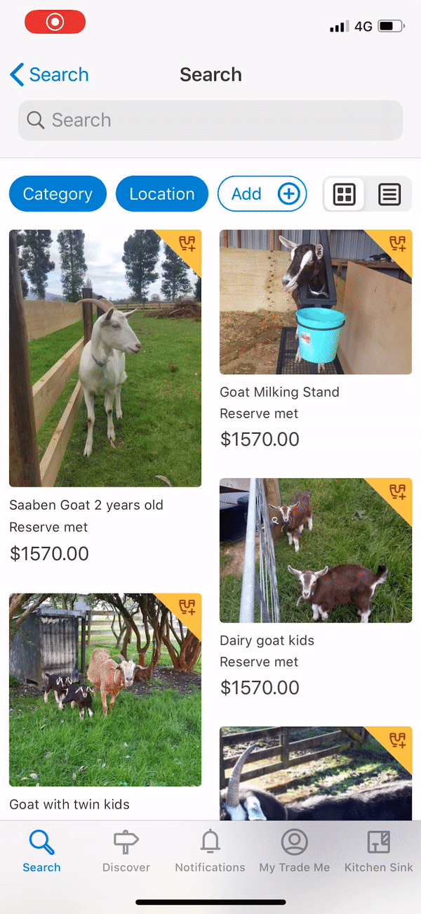
Historically, our mobile designers specialized in a single platform—iOS designers lacked Android experience, and vice versa—resulting in siloed designs and a confusing experience for the 20% of customers using multiple operating systems, like an iPad and an Android phone.
I knew to start solving this problem, we needed designers to start investing in both platforms and not stay siloed in their own platforms.
With dark mode on the horizon, this was the best time to redesign our mobile apps , this project to be ideal chance for a reset. We aimed to bring a more contemporary look to our apps and ensure our brand is consistent all touchpoints.
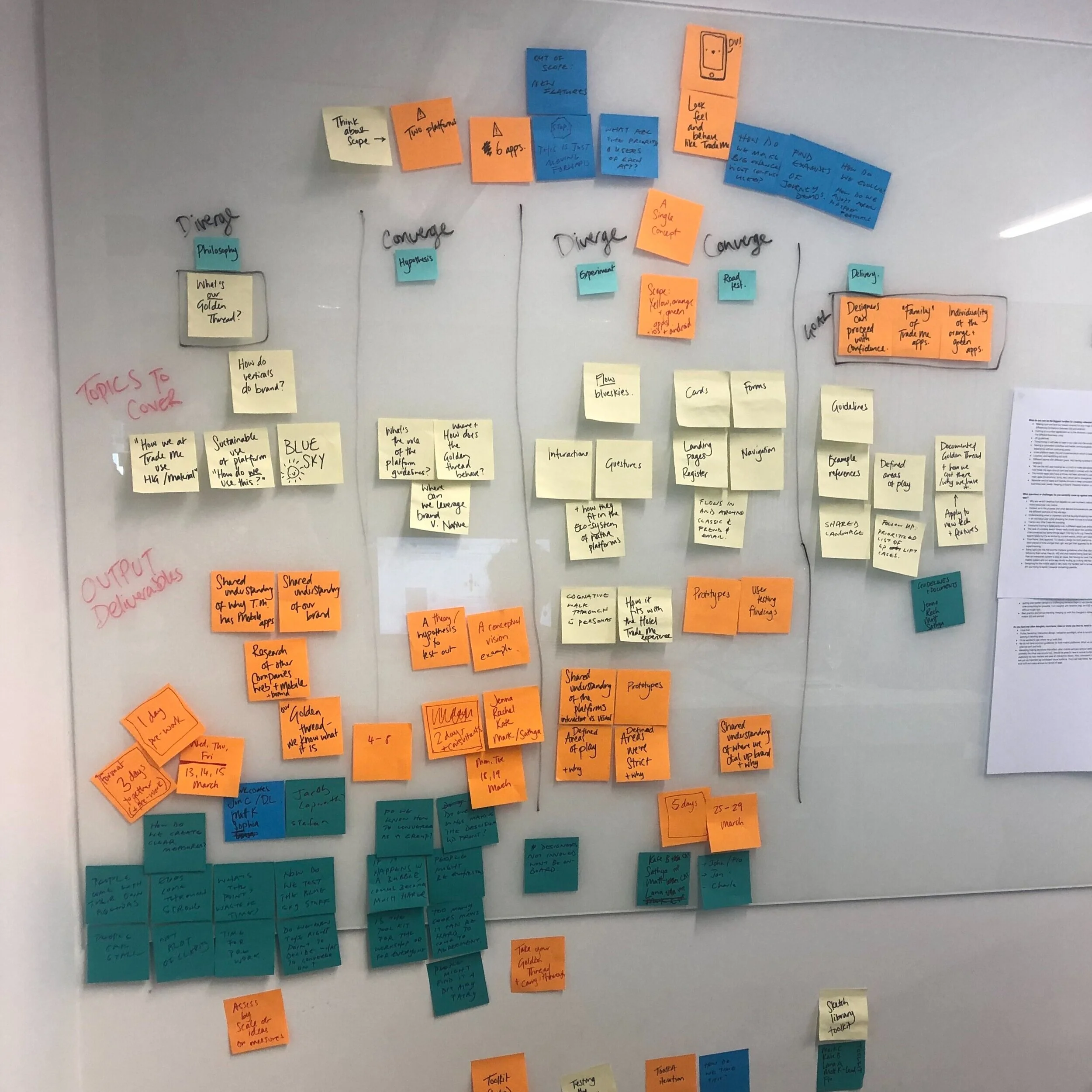
Recognizing this as the foundation of a new design system, it was essential for everyone in the mobile guild to feel ownership in what we as a team needed in the system. I organized a series of workshops to ensure the whole team was aligned and understood the foundations of our design system so that they could feel more confident in making updates and changes in the future.
The goal of the workshops to identify our “Golden Thread”: the design rational that we would weave into our design system to make them feel like a family.
Workshop 1 – Blue Sky
We reimagined the possibilities for the look and feel of our mobile apps, exploring what makes them distinctly Trade Me. This involved pushing the boundaries of what felt on-brand versus off-brand. We established guidelines that captured our brand through purposeful pops of color, user-guiding typography, and consistent design elements.
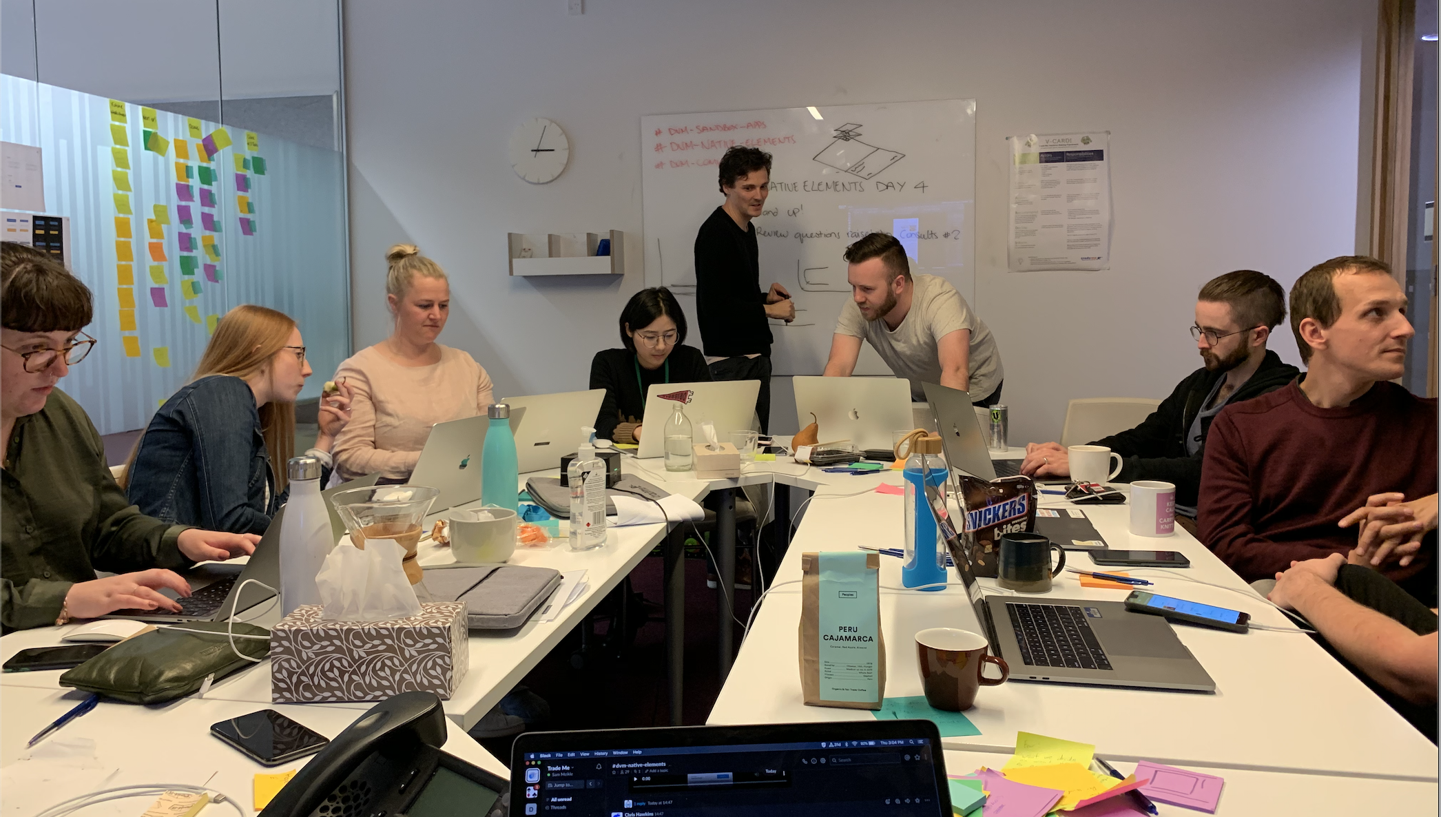
Workshop 2 – Native Elements
Building on the Blue Sky ideas, we experimented with how our brand elements could integrate with native design languages. We assessed the value of using native versus custom components for both user experience and business goals. This workshop included deep dives into accessibility, dark mode, and animation. This gave us a foundation for iOS and Android components, which I further developed, while my team started defining a system for dark mode.
Workshop 3 – Road Test
With a version one design system now ready to use, we spent a week road-testing these newly styled components to two of our most-used user flows. We tested dark mode and encouraged designers to work across both platforms, creating space for team feedback and input. This workshop gave us clarity on components needing refinement and those we felt confident about, marking the beginning of our first mobile design system.
Our mobile developers were essential in building a system that fully leveraged each native platform's capabilities.
These workshops were both for designers and developers alike. Guided by technical leadership from our iOS Lead Software Engineer Chris Hawkins, and Android Principal Software Engineer Jamie Sanson, we developed two sandbox apps to test our ideas’ feasibility. These stand-alone apps, updated nightly, allowed us to test dark mode implementation across devices in real-time, experience of tap and push feedback and animations firsthand, and give the business real-time visibility into our progress.
What was identified as our Golden Thread
We are bold and simple. We keep the UI clean and uncluttered.
Our colors and typography are thoughtfully selected to reflect our identity and serve as our main tools for reinforcing the brand. The palette is vibrant and approachable, steering clear of a stuffy, corporate feel. Our sans-serif typeface is honest and hardworking, embodying our values and tone. These are the tools we lean on to bring our brand to life
Our members are the heroes of Trade Me.
Our brand is here to support their journey, celebrating the Kiwis who make Trade Me what it is. We simplify visuals to keep the focus on our members’ content, dialing up brand elements only where they build trust in decision moments—never competing with our members' contributions.
We respect the decisions our members make.
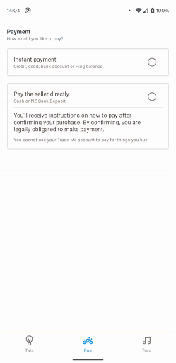
We work to earn a valued place on our users' devices, honoring their preferences, whether for Dynamic Type or Dark Mode. Members recognize familiar patterns from their chosen operating system, so Trade Me will always feel intuitive and welcoming, even on a first visit.
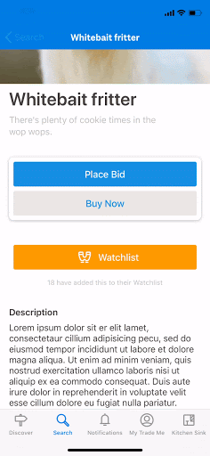
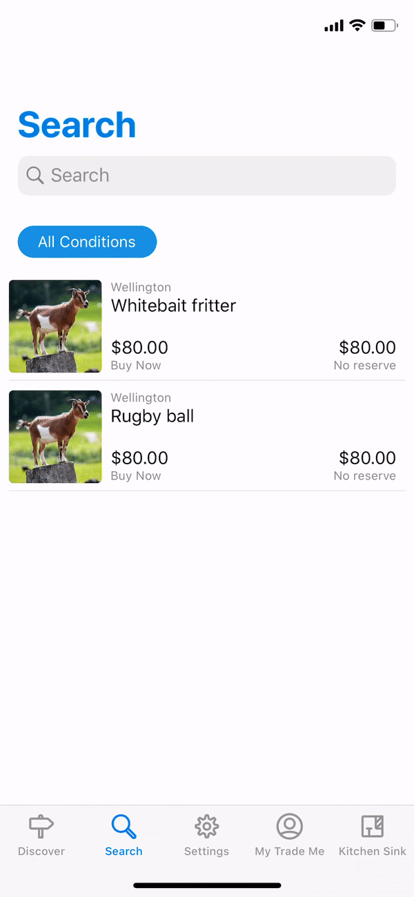
Top: Our Trade Me app.
Bottom: The new vision
To validate our approach, I created three screen variations showcasing both high-brand and low-brand moments.
With the support of our UX team, I developed a survey targeting our mobile users to understand their perception of our new blue-sky designs.
We divided our survey participants: 50% viewed the current Trade Me screens, while the other 50% saw the same screens with the blue-sky styling. We asked respondents to select from a list of 31 words that best described what they saw.
The word "Fresh" was chosen 25 more times for the blue-sky designs than for the current Trade Me designs.
In contrast, responses for the current app highlighted words like "professionalism" and "usefulness," but also "boring."
This gave us the confidence to move forward and take our learning to create our mobile design system.
Next Project: